Visual Representations of U.S. Scholars and Institutions
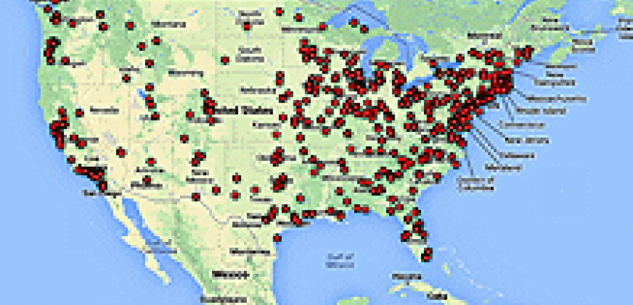
 Home institutions for U.S. Scholars
If you have ever wondered about the geographic reach of the Fulbright Scholar Program, you will find these three maps of great use. They depict participation in the program in 2012-13 from three different angles: institutions abroad that hosted U.S. scholars via the Core and Specialist programs; the home institutions of these same U.S. scholars; and the institutions in the U.S. that hosted Visiting Scholars via the Occasional Lecturer Fund, a program which enables U.S. colleges and universities to invite a Fulbright Visiting (Non-U.S.) Scholar to visit them and give a brief lecture.
The maps were created via an app on Google Drive that allows maps, charts, and tables to be placed side-by-side, so when you open the above hyperlink you will view the “Map” tab. This will display a map of the world, with each of the markers representing an institution. You can click on the marker and see more info about that particular institution. This is a format similar to Google Maps, so if you are familiar with that, this shouldn’t be difficult to navigate.
You can also utilize the “Table” tab to see a spreadsheet of the data that is easier to sort. All of the information that pops up when you click on the markers is listed in rows similar to an Excel workbook, making it easier to see and analyze all of the data. There is also a “Chart” tab for the Host and Home Institutions pages that will display relationships among the data (for example, the connections between Home Institutions and the states they are in, making it easier to see the biggest and smallest states in terms of program participation). Lastly, all of the individual tabs are sortable through the blue “Filter” button to the left-hand side, which will allow you to narrow the focus to one or more institutions or countries that you may be interested in.
There’s a lot that you can learn from these documents, so we invite you to dive in and enjoy! They are organized so that no matter how you’d like to analyze the information, this blend of maps, tables, and charts will be helpful to you. We hope that through these visual representations and hard data you can get a true sense of the enormous scope of the Fulbright Scholar Program.